How to Compare a Design to Your Build, Pixel by Pixel
Overlay the mockup on the live page and let difference blending find the drift. The method, what each blend mode is for, and what the tools here cost.

There is a gap between a build that looks right and a build that is right. Side-by-side comparison closes the first one. It does not close the second, because your eye cannot reliably resolve a 2px baseline shift or a 15px versus 16px gap when the two things being compared sit 400px apart on screen.
What closes it is putting the design directly on top of the running page and letting subtraction do the comparing.
The method
- Export the design as a PNG at 1x CSS pixels, matching the viewport width you are building at.
- Overlay it on the live page, positioned at the top-left origin.
- Drop opacity to around 50% and drag it until the largest structural elements line up.
- Switch compositing to
differenceand set opacity back to 100%. - Read the glow.
Step 4 is the one that matters. At 50% opacity you are still doing the comparison with your eyes, and your eyes are the thing that failed you in the first place.

Reading a difference render
The mode is defined as the absolute value of the backdrop colour minus the source colour, computed per channel.1 Identical pixels subtract to zero in red, green and blue, and that is black. What is left on screen is exactly and only what differs, and the brightness is the size of the error.
That last part is worth taking literally, because it makes the render quantitative rather than impressionistic. Paint a page one colour, overlay an image six units off in green only, and the result is a flat rgb(0, 6, 0): nearly black, but not black, and the six is the actual error. I measured that in headless Chromium to check the claim rather than assume it.
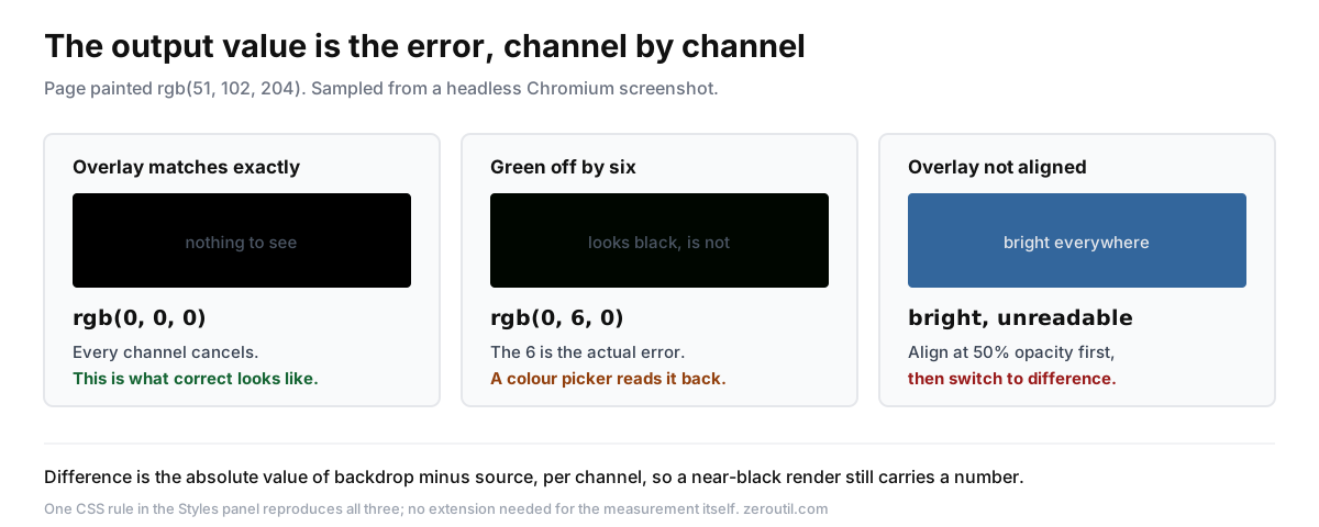
In practice you learn to recognise a few signatures:
- Thin bright outlines around text mean the text is offset. A single row of edges is a baseline or line-height difference; edges on the left of every glyph mean letter-spacing or font-size drift.
- A solid bright block means something is present in one layer and absent in the other, or a fill colour is wrong.
- A bright arc on one corner of a card is a
border-radiusmismatch. - A soft halo around an element is a shadow with the wrong blur or spread.
- A one-pixel line along an edge is usually
borderversusoutline, or a fractional position from a percentage width.
These are the drifts nobody catches by eye and everybody notices in aggregate. They are what makes a build feel slightly off without anyone being able to say why.
What the other blend modes are for
difference is the measurement. The rest get you to the point where it is readable:
- normal at 40 to 60% opacity is for coarse alignment. You cannot position a layer under
difference, because a badly aligned difference render is pure noise. - multiply darkens where both layers are dark. Useful on light designs to check whether a background tone matches without the harshness of a difference render.
- overlay preserves highlights and shadows, which helps when comparing gradients and images rather than layout.
- invert is not a blend mode at all. It flips the layer's colours and composites normally. Occasionally useful for making dark-on-dark comparisons legible.
A tool that only offers opacity is a tool that only does step 3.
Doing it without any extension
You do not need to install anything for a one-off check, and you do not have to give up the difference render either. One rule in the Styles panel:
html::after {
  content: "";
  position: fixed;
  inset: 0;
  background-image: url("data:image/png;base64,...");
  background-repeat: no-repeat;
  background-position: top center;
  mix-blend-mode: difference;
  z-index: 2147483647;
}
Use image to base64 to inline the mockup so you are not fighting a file path, and image cropper first if you only care about one section.
The pseudo-element matters. A background-image on html itself paints behind the body, and almost every page gives body a background of its own, so the mockup ends up completely invisible. Setting opacity on html does not help either: it fades the whole page, its own content included, rather than blending one layer against another. Both are easy mistakes and neither shows an error message, which is what makes them annoying to debug.
What this genuinely does not give you is the workflow. The overlay does not survive a reload, you cannot drag it into place, switching blend modes means editing CSS each time, and holding more than one comp at once means managing several rules by hand. For a single check that is a fine trade. For a component across three breakpoints it is not.
What these tools cost
Design overlay extensions have been around for over a decade, and the established one is PerfectPixel by WellDoneCode. It works well. It is also why people assume the workflow has a price attached, because the parts you reach for after the first week are behind a subscription.
Here is the split, from the vendor's own pricing page:2
| PerfectPixel Free | PerfectPixel Pro | Pixel Perfect Advanced | |
|---|---|---|---|
| Price | $0 | $25 per year | $0 |
| Layers per domain | 2 | Unlimited | Unlimited |
| Ad-supported | Yes | No | No |
| Folders for layers | No | Yes | No |
| Layer rotation | No | Yes | No |
| Dark theme | No | Yes | Yes |
| Custom accent and CSS | No | Yes | No |
Two honest notes on that table. Layer rotation is a real feature and Pixel Perfect Advanced does not have it; if you overlay rotated comps regularly, that gap matters. And its folders organise the image library rather than grouping layers on a page, which is a different thing from what the Pro tier offers.
The row that decides it for most people is the second one. Two layers per domain covers one page against one comp. The moment you are comparing a component across three breakpoints, or holding a "before" and an "after" beside the current build, you are over the line. That is not an edge case, it is Tuesday.
Pixel Perfect Advanced gives away the unlimited-layers tier: all five compositing modes, per-site auto-restore so your layers come back on reload, click-through on locked overlays so the page stays usable underneath, fixed or absolute positioning, dark mode, and English and Russian. No account, and no analytics SDK in the build.
It installs on Chrome and Firefox.
Where this fits in a workflow
Pixel comparison is a finishing pass, not a development mode. Run it while you are still moving elements around and you get a wall of glow that tells you nothing. Build the thing, get it structurally correct, then overlay once and clear the list of small drifts in one sitting.
It also pairs badly with a design that is still changing, which is worth saying out loud. If the comp moves weekly, comparing against it pixel by pixel is measuring drift against a moving reference. Wait until it settles.
Two things worth having open alongside it: image color picker for pulling exact values out of the comp when the difference render shows a fill mismatch, and color converter for getting those values into whatever format your stylesheet wants.
If you want the implementation details rather than the workflow, there is a technical write-up of how the overlay is built on NoWaterProgramming, covering why a wrapper element breaks mix-blend-mode and how click-through works without touching pointer-events.
Sources
Every number in this article traces to a source below. Where a claim could not be sourced, it was cut rather than softened.
- Primary sourceW3C
That the difference blend mode is defined as the absolute value of the backdrop colour minus the source colour, computed per channel, so identical layers produce black.
- Primary sourceWellDoneCode
The Free and Pro tier split as published by the vendor, including 25 dollars per year for Pro, two layers per domain on Free, that Free is ad-supported, and that folders, layer rotation and dark theme with customisation are Pro-only.
Topics
- Design
- CSS
- Workflow
- Developer Tools
- Qa
Get new tools by email
New tools and the occasional deep-dive, about once a month. No spam, no sharing your address, unsubscribe in one click.